App Icon Case Study —
Bowers & Wilkins PX Headphones
In October 2017 Bowers & Wilkins launched its first noise canceling headphones, the PX. Seeing an opportunity to create an iconic design for a legendary audio brand, I self-initiated to create a unique app icon that reflects the product and brand.
This is the story of how I overcome design and organizational challenges, as well as learnings I picked up along the way.
YEAR
Designed at Bowers & Wilkins in 2017
ROLE
Design, Direction, Production
TOOLS
Sketch, Illustrator, Photoshop
TL;DR
16 Seconds Video Evolution
I created this 16 seconds video to show the design iterations of the app icon.
An app icon is an introduction and/or recollection to your brand, product, and your app. It's a really important detail in the overall experience, sometimes overlooked in the product design process.
The Design Challenge
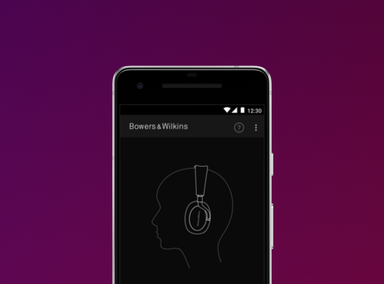
I was really excited to create something from scratch, but there were already some tough guidelines to follow! I had to use photography and a full logo text. Using photography is not recommended by Apple, and there's usability problems with the small logo text (because the logo is quite long).
There were back and forth discussions with the team here in the US and the brand people in the UK, so while working on the app's interface, I quickly finished the first version of the app icon following the guidelines. My goal was to get the designs out as soon as possible so people can start seeing it as we dogfood our app.
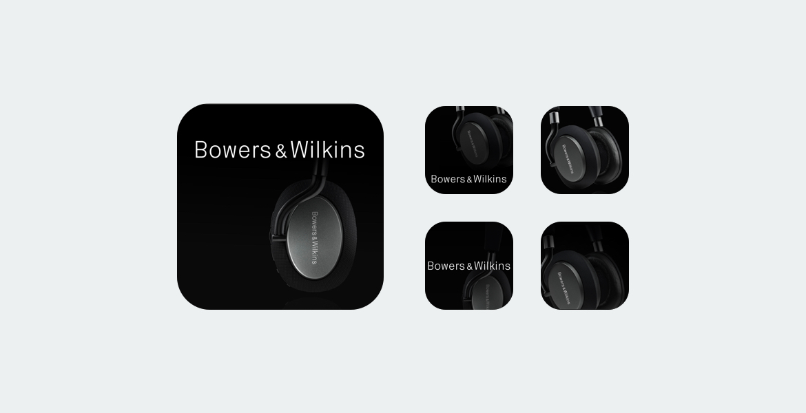
This is the first designs, we chose the left icon to include in the build, with a few different visual explorations on the right.
Having the actual app icon while we dogfood our app was a crucial part of the process. In usability testing, we can validate our ideas, the same process applies with the app icon. In a way, I wanted to prove that it's not the direction we should be taking. We validated that the photograph of the product is too small and dark and the logo text is too small to be legible.
Design Principles
A few guiding principles for designing the app icon:
- Scalability
- Recognizability
- Uniqueness
Quick iteration on an idea
Before diving in deeper, I quickly created and showed some mockups of a PX headphone illustration and it was well received so I dived in more with the explorations. The purpose of this was to excite people and get buy-ins before I spend more time focusing on the design.
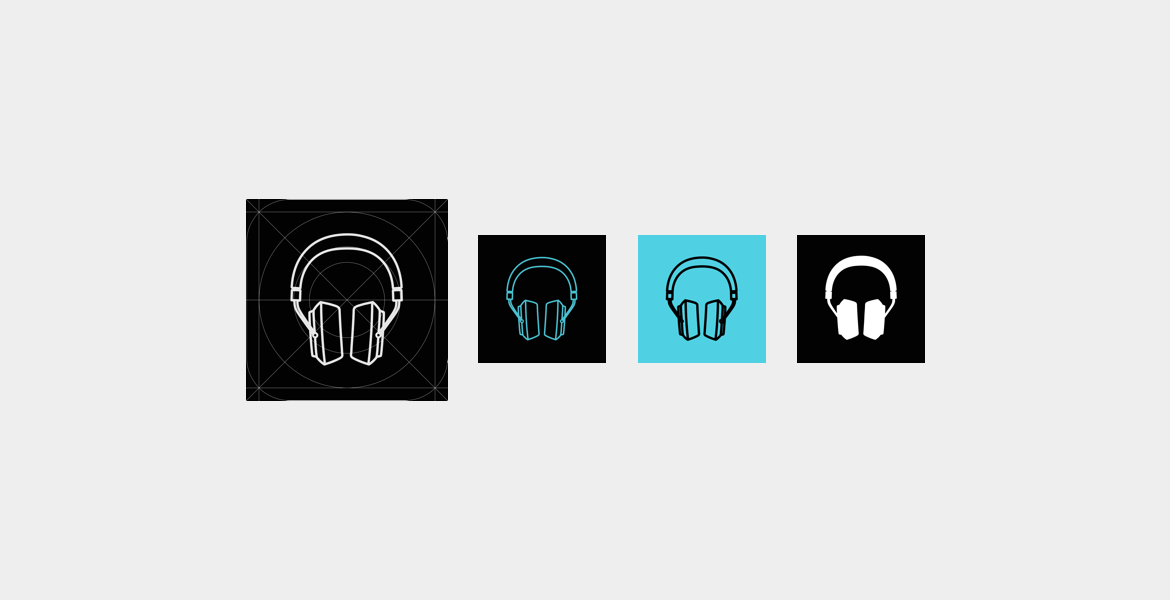
I chose the front view headphone illustration because it's universally recognizable as a headphone.
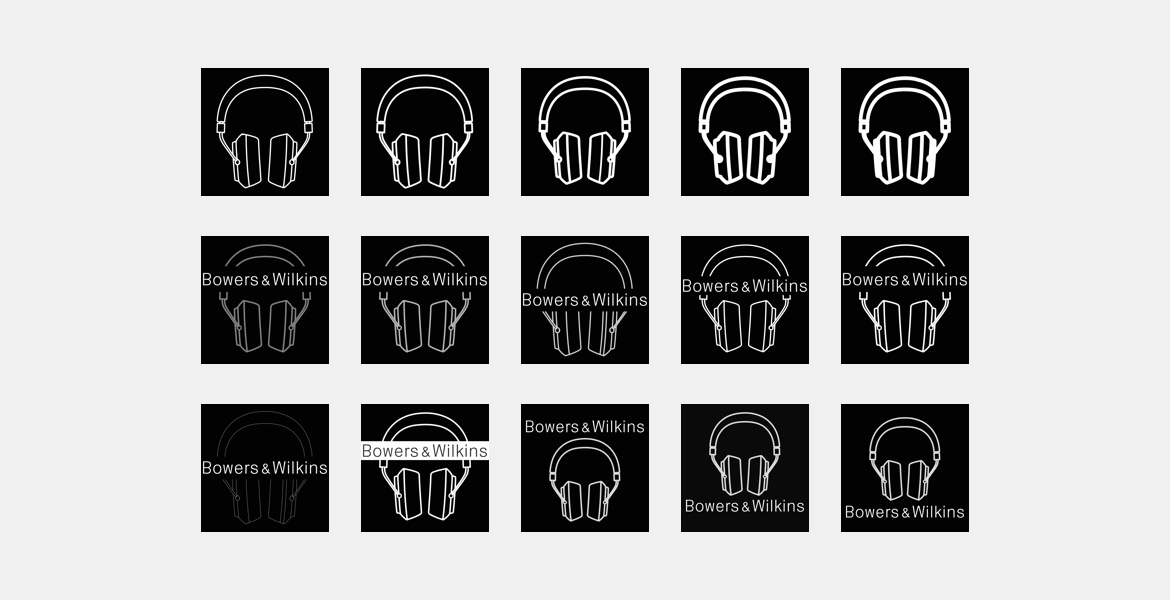
At this point, the brand people were still requiring the use of the logo, so I did both to compare them side by side.
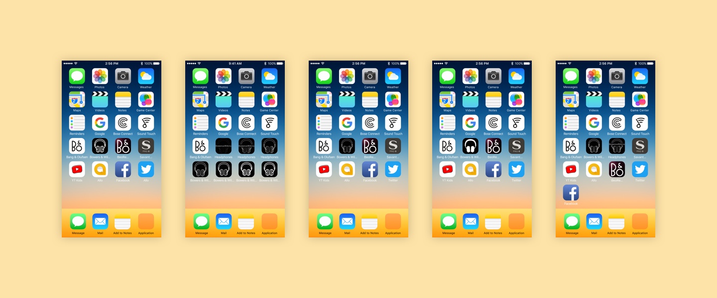
I always test my designs in the actual environment, in the context of the home screen, and review them in an actual phone. Both context and environment are equally important to help make decisions. I made sure to include the non-logo icons supported by the logo as the app name.
Overall feedback was positive but that it looked too generic. A quick research on the app store shows other competitors using headphones illustration. It is good that it is recognizable and universally understood as headphones, but didn't stand out enough separate ourselves from the crowd.
Back to work — in time for launch day!
I had a few days to change the app icon and get approval from all the stakeholders to be on time for launch, as we were submitting to the App Store and Play Store.
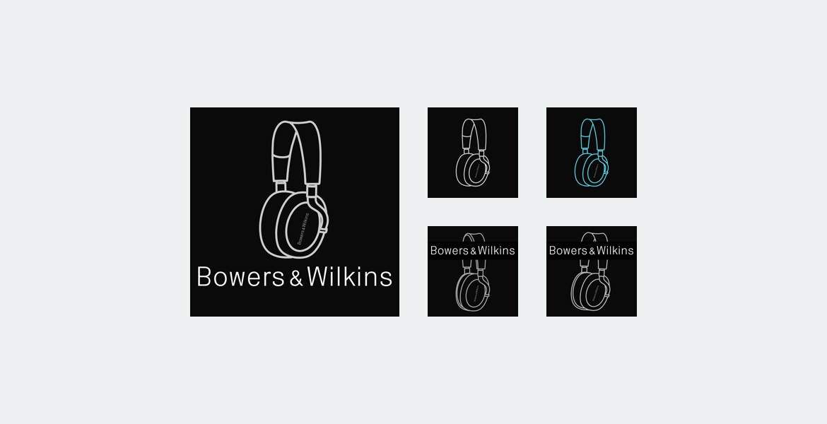
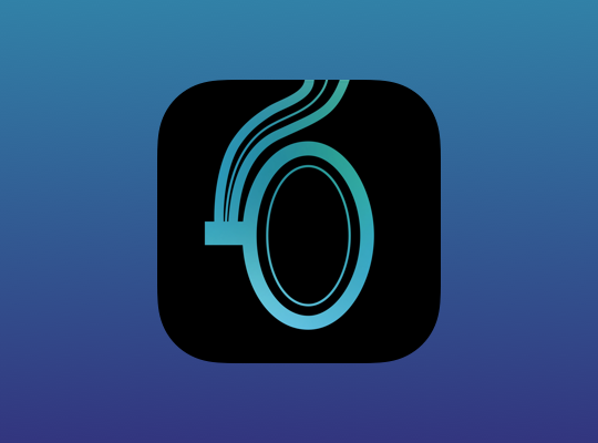
Chosen app icon with logo text on the left, there is just enough details in the illustration.
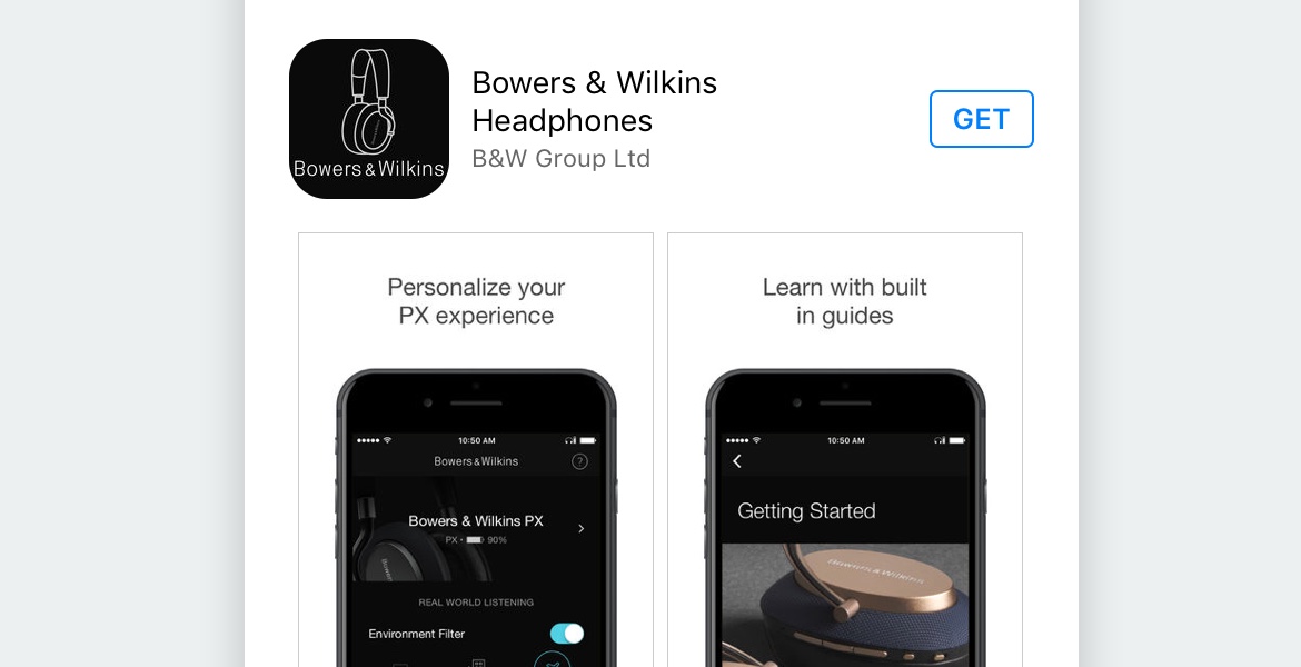
App icon successfully launched, screenshot from the App Store. Woohoo.
After launch...
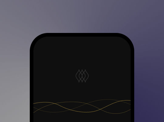
Post launch, I had some time to reflect and make improvements to the app icon design. I thought deeper about the brand and how sound quality and precision is one of the unique strengths of Bowers & Wilkins products.
My main design goal was to capture this quality and personality in the app icon. How might we show, and tell, the world who we are at a glance, starting from the first impression?
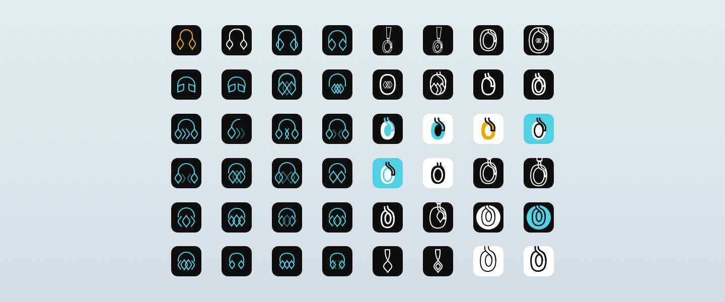
Going broad with the idea of what a headphone is, what's on the other end, what is music, what is audio etc. Exploring patterns and symbols.
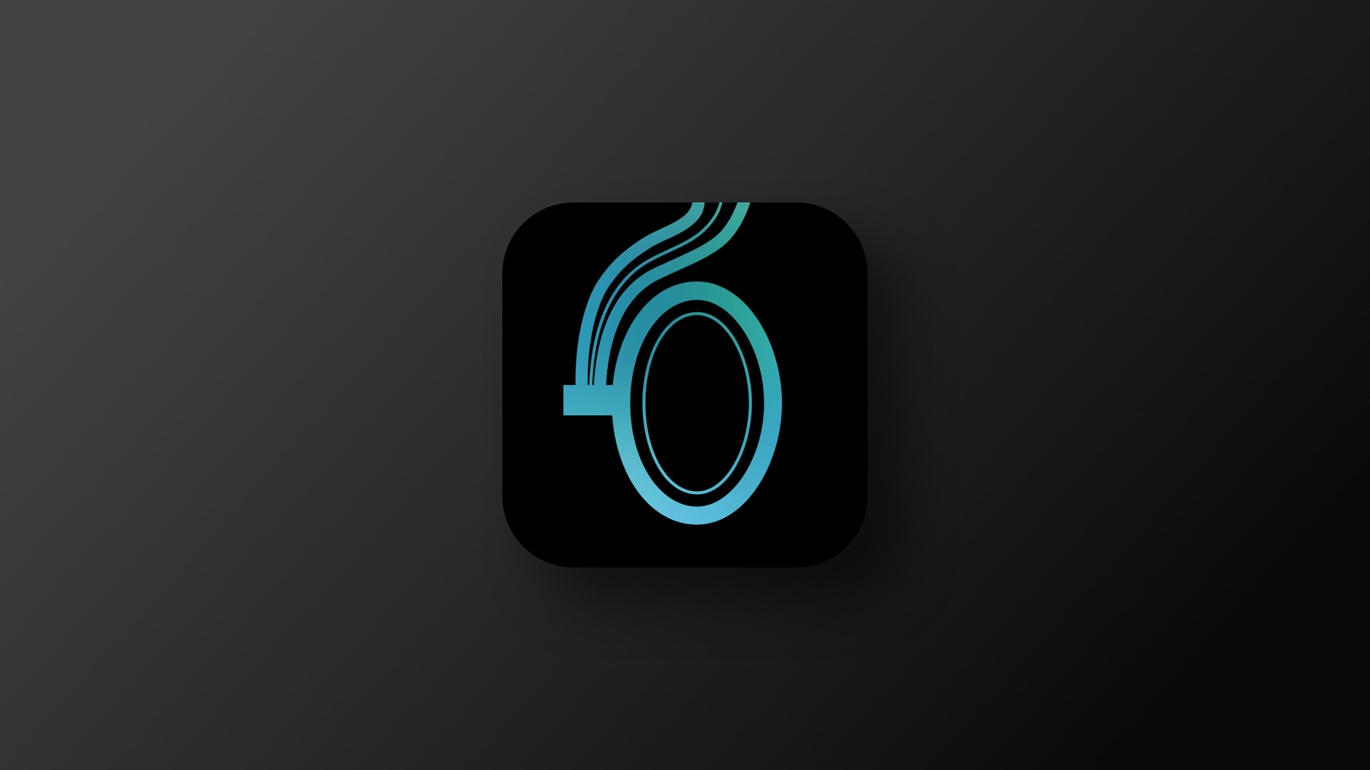
I really like the organic shapes of the cup of the headphones, in a way signifies the idea of sound and music being fluid, while still having a unique identity.
There's something simple and unique about the shape, it being abstract as the idea of audio is fluid, and have movement, but at the same time being recognizable and iconic for Bowers & Wilkins headphones and brand.
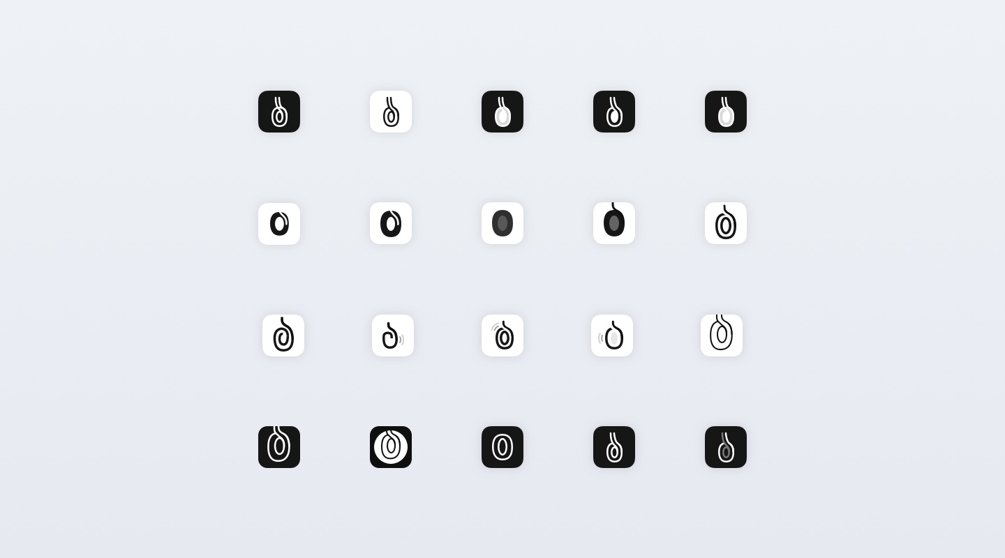
Pushing the designs further...
Exploring on this idea of the cup shape as the main focal point, and play on negative space and shapes. My goal is to make it abstract, without going too abstract.
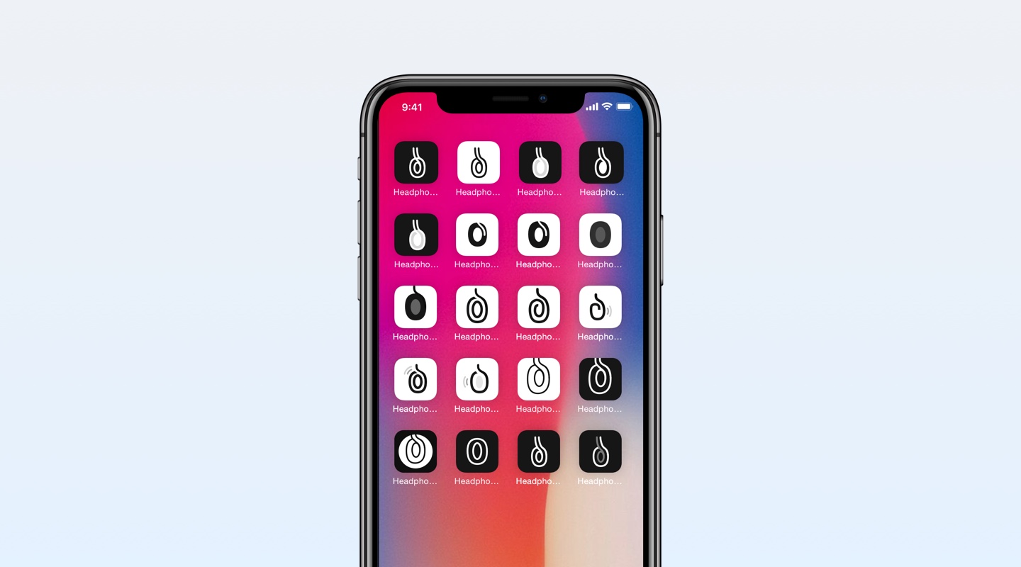
Viewing and presenting the designs on an actual phone, so we can make better design decisions.
Narrowing down the designs

Here are the selections out of the explorations, we are getting closer!
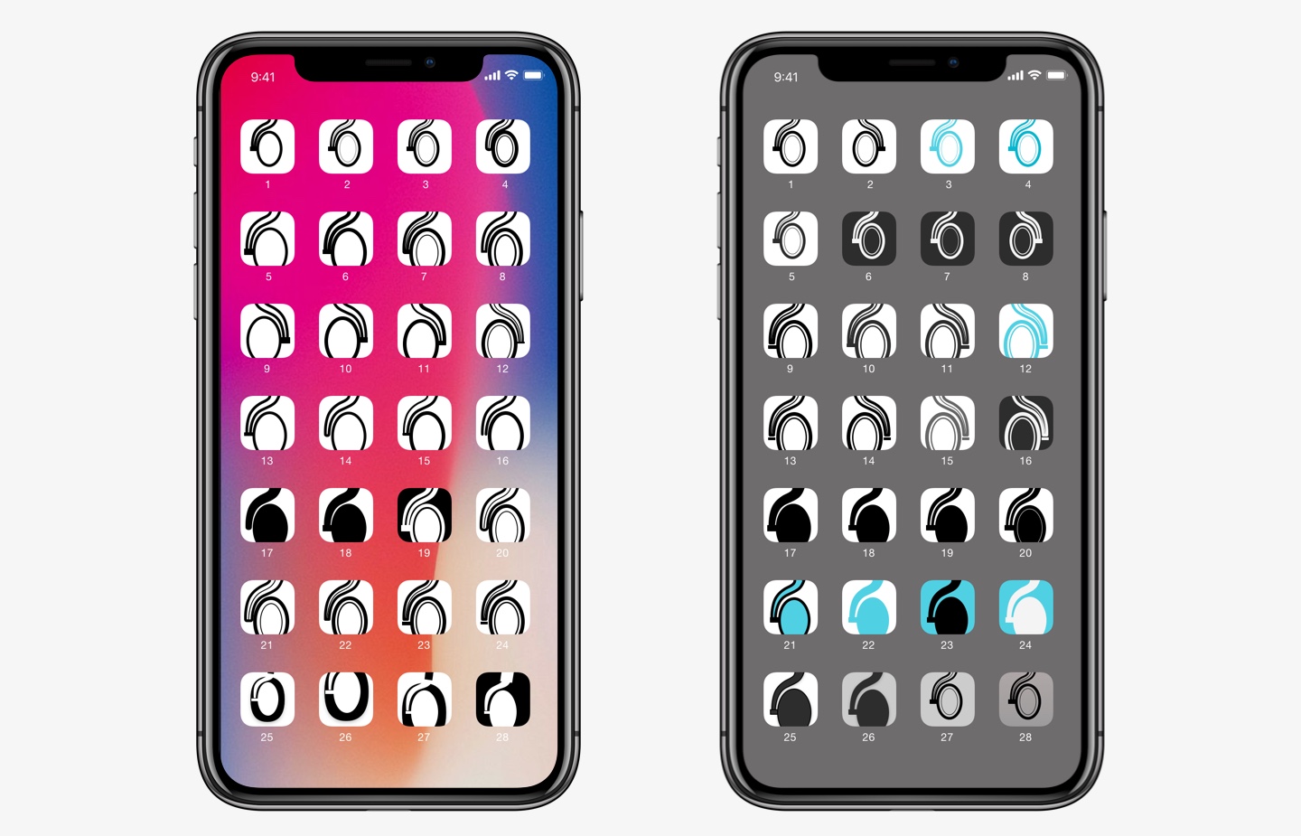
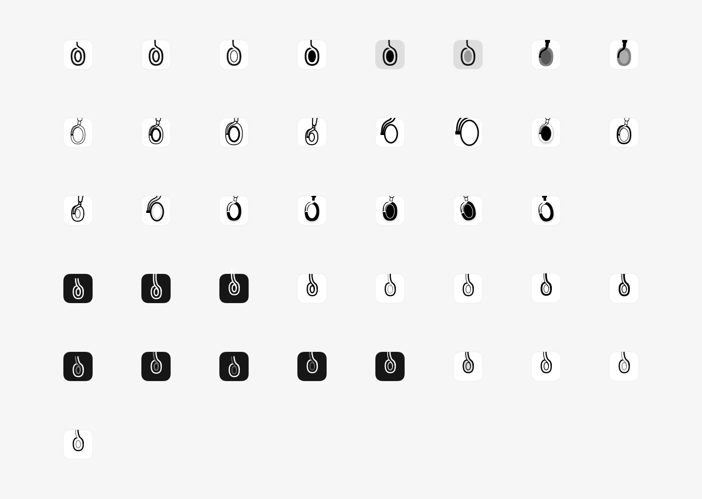
With the final selections, I wanted to expose different angles, negative space, white space, small design details such as curve, thickness, sharp vs rounded borders etc.
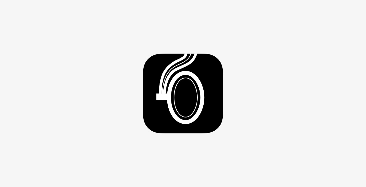
Final solution
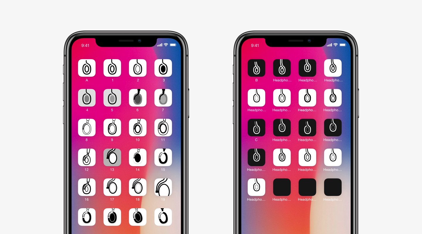
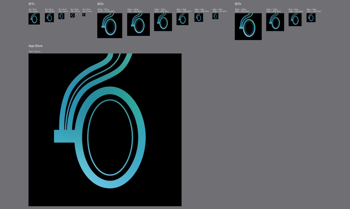
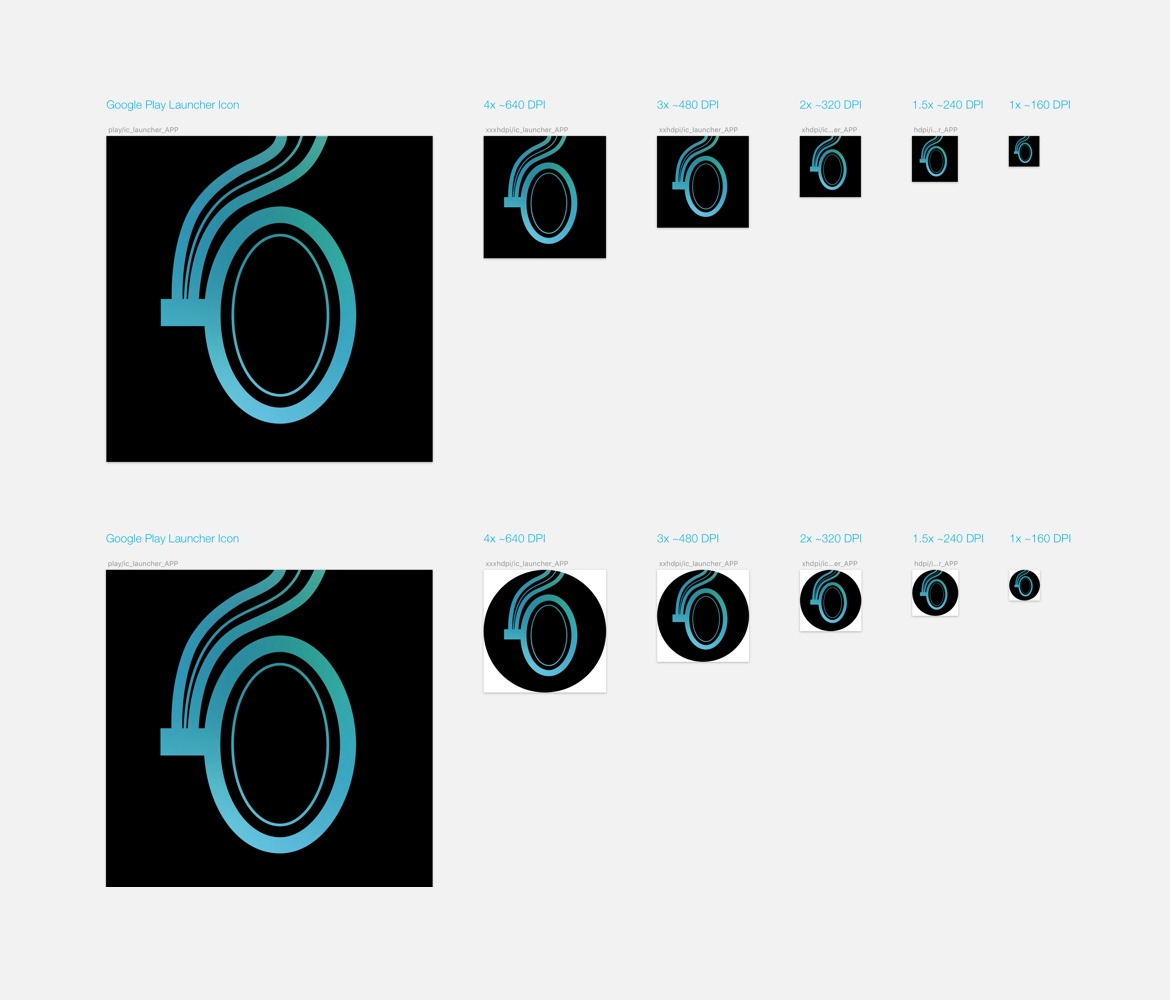
In the final phase of the design process, there were a few things I needed to make sure of. They work on a basic black and white, a variety of background colors, and they work on small sizes in all different platforms.
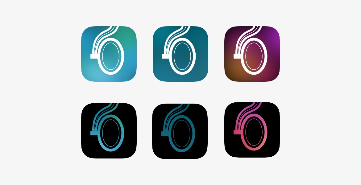
Color studies.
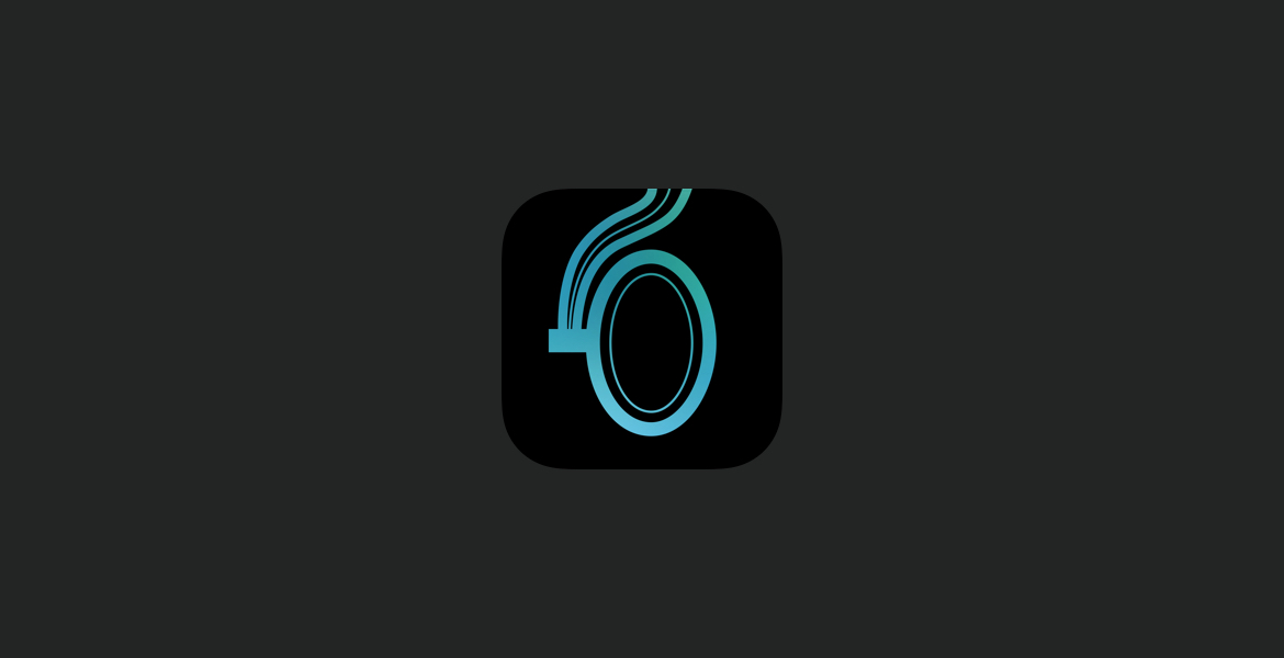
The end result.
Production
App Store and Play Store assets.
Learnings
Through out this creative process I learned many things, and if I had to do it again I would:
- Set aside time to plan for designing the app icon, ideally in the beginning of the project so that if there's any issue we have time to work it out.
- Test in different sizes, and make sure you test on different platforms and different brands! (somehow we all missed testing with a Samsung Edge phone which has a rounded icon).
- Don't just follow rules blindly, keep asking questions. It's important that every detail is part of the whole user's experience. We as designers are responsible creating that experience and will define how our customers remember our product.
More Projects
Imgur Accolades • Celebrating the bestProduct Design, Web, Apps, Illustrations, UX Research

Imgur Emerald • A new subscription productProduct Design, Web, Apps, Branding, UX Research
Melee • Designing for gaming communityProduct Design, iOS, Android
Bowers & Wilkins Home • Creating a seamless setup experienceProduct Design, iOS, Android, Animation, Illustration
Bowers & Wilkins PXProduct Design, iOS, Android, Iconography
Bowers & Wilkins App IconIcon Design
Flickr iPadMobile App Design, iPad
Flickr iPhone RedesignMobile App Design, iPhone

Snapshots • Design snippetsVisual, Interaction, Animation
Email —
LinkedIn —
Copyright © 2025 Gabriele Angeline. All Rights Reserved.